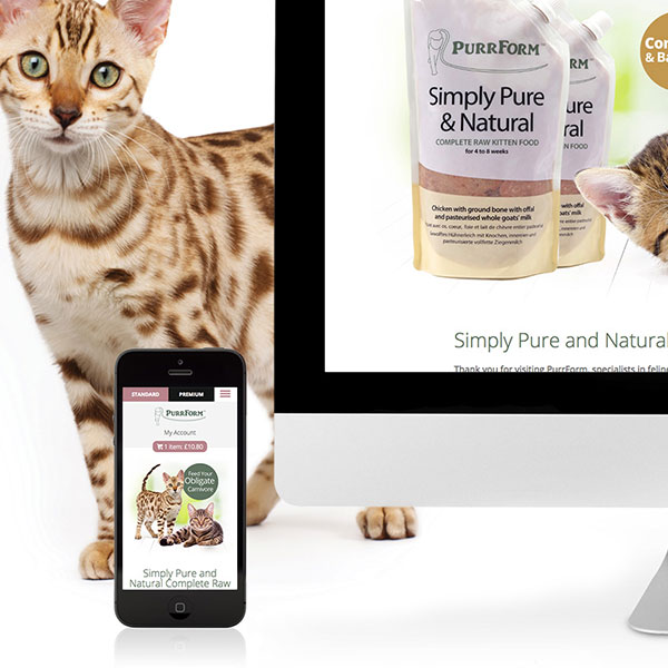
Luxury, elegance, style
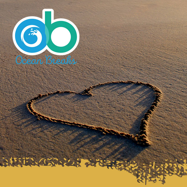
We recently undertook a re-branding for Norfolk holiday cottages company Ocean Breaks. As part of the re-branding we redesigned the logo, refreshing both colours and typography.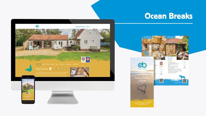
The new logo is more reflective of the name ‘Ocean Breaks’, making use of colours associated with the sea and using a distinct ocean wave motif to form part of the ‘O’. Retaining a link to the original logo we maintained the use of a script font, updating it to the modern and stylish ‘Intro Script’ from the more traditional Brush.
The new colours, mid-blue and sea-green, are utilised throughout the website and are complemented by a soft sand colour, giving the whole site a warm understated feel. Making use of Intro Script for the headings, strikes the right balance between formal and casual, ensuring the pages look friendly and informative.
The new website is easy to navigate, working with just four main headings – Home, Holiday Cottages, Discover Norfolk and Contact Us. All pages feature the stylised sand/seashore motif in either sand-yellow or seagreen, as well as familiar graphics of brolly, deckchair and seagull.
The ‘Discover Norfolk’ page is designed to be regularly updated with fresh content on interesting features of the Norfolk coast and countryside.
At the heart of the website, however, is the ‘Holiday Cottages’ page with its links to the wealth of information about each of the properties Ocean Breaks lets out. The individual pages make extensive use of suitable graphics to aid client navigation. The pages have ‘slide-in’ photos to add a subtly dynamic touch that never overwhelms the page with unnecessary gimmicks and effects. Much use is made of bright, well-framed photography to show off every property in its best possible light and the new website reflects the Ocean Breaks philosophy of ‘Luxury, Elegance, Style’.