Purrfectly responsive
The use of mobile devices to surf the web is growing at an astronomical pace, but unfortunately much of the web isn’t optimised for those mobile devices. Mobile devices are often constrained by display size and require a different approach to how content is laid out on screen.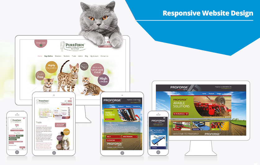
There is a multitude of different screen sizes across phones, tablets, desktops, game consoles and TVs. Screen sizes will always be changing, so it’s important that your site can adapt to any screen size, today or in the future.
Responsive web design responds to the needs of the users and the devices they’re using. The layout changes based on the size and capabilities of the device. For example, on a phone, users would see content shown in a single column view; a tablet might show the same content in two columns. To attempt to provide the best experience, mobile browsers will render the page at a desktop screen width, and then try to make the content look better by increasing font sizes and scaling the content to fit the screen. For users, this means that font sizes may appear inconsistently and they have to double-tap or pinch-to-zoom in order to see and interact with the content.
When developing a mobile site a common error is to create page content that doesn’t quite fit within the specified viewport. On both desktop and mobile devices, users are accustomed to scrolling websites vertically but not horizontally. If an image is displayed at a width wider than the viewport, a user will have to scroll horizontally or zoom out in order to see the complete image, resulting in poor user experience. Content, therefore, should be adjusted to fit the viewport, so that users never need to scroll horizontally.
Since screen dimensions and width vary widely between devices (e.g. between phones and tablets, and even between different phones), content should not rely on a particular viewport width to render well. At Fine Design, we understand the complexities involved in designing responsive websites and will ensure that your site will always look its best, no matter what it is being viewed on.

 Elevate your website’s performance with proactive maintenance